B2B Inquiry Form Design: Turn Website Traffic Into RFQs
Field choices, single vs. multi-step, trust signals, spam protection, lead routing, and GA4 tracking, with only numbers you can trace to a source
A B2B inquiry form should ask only what you need to reply (company, country, quantity, application, timeline), show a response time and real contact details beside it, route every submission to a monitored inbox, and track success with GA4 generate_lead as a key event.
Contents ▾
Your website gets a few hundred relevant visitors a month. People read your product pages. And yet the inbox sees maybe one real request for quote a month, on a good month. The reflex is to buy more traffic. But when traffic arrives and RFQs don't, the problem usually sits in the last mile: a buyer reaches your inquiry form and decides not to press Submit, or presses it and the message never reaches a human.
We have seen the same pattern on B2B marketplaces. In one stage-lighting distributor engagement, the storefront had six to seven hundred daily impressions and forty-odd on-platform chats, yet zero formal inquiries. Visibility was not the issue; persuasion was. On your own website, the inquiry form is where that persuasion either lands or leaks.
One ground rule before we start. The web is full of claims like "removing one field lifts conversions by X%" or "multi-step forms convert X% better." We tried to trace them. Most lead back to other blog posts, not to published studies with a method you can inspect. This guide only cites numbers we could trace to original research or official documentation. Where we could not, we state the principle and leave the number out. As you will see, the right decisions are clear anyway.
This is part four of our website series for export-oriented manufacturers. If you are still deciding whether you need your own site alongside a marketplace store, start with Alibaba store vs. your own website. If your product pages are not organized yet, fix your catalog website structure first, then come back to the form.
1. Traffic but no RFQs: confirm the form is actually the problem
Short answer: "No inquiries" can break at four points: the wrong traffic, product pages that do not answer buyer questions, a form people do not want to fill in, or submissions nobody receives. Use GA4 and your own records to find which one before you redesign anything, because each has a different fix.
Most small manufacturers treat "the website doesn't generate leads" as one problem. It is really a chain of problems. The two most expensive misdiagnoses are treating a traffic problem as a form problem, and treating a delivery problem as a demand problem. The second one is brutal: a buyer did submit, your system routed the message to a spam folder or to a salesperson who left last spring, and you concluded the market was cold and cut the budget.
Nielsen Norman Group once studied 79 business users across B2B sites and found that B2B sites had a task success rate of just 58%, versus 66% for mainstream consumer sites. The research dates from 2006, but the structural issue it describes has not changed: B2B sites tend to be organized around the company rather than the buyer, and they lock information behind forms. The same article notes that users are very reluctant to fill in lead-generation forms, and that you must establish a certain level of credibility before people will give you their contact details.
In other words, the form may not be the first thing to fix. Use this table to locate the bottleneck:
| Symptom | Likely bottleneck | Check first | Fix first |
|---|---|---|---|
| Few product-page views, mostly from outside target markets | Wrong traffic | GA4 country and source reports | Target-language content and site architecture |
| Product pages get views, few clicks to the quote page | Weak product pages | Path from product page to quote page | Specs, applications, certifications, lead times |
| Many people start the form, few submit | The form itself | Gap between form_start and form_submit | Field choices and error handling |
| GA4 shows submissions, inbox shows nothing | Delivery failure | Compare database records with the inbox | Notification routing and sender authentication |
| Mostly spam and sales pitches arrive | Weak protection | Source and pattern of spam | Honeypot, Turnstile, or reCAPTCHA |
If your bottleneck is in the first two rows, read our guides on multilingual site architecture and product pages that answer engines can read. No form can rescue a product page that buyers cannot find in their language, or that leaves them unsure whether your spec fits their application.
When you don't need to touch the form. If your form already has four or five fields, works smoothly on a phone, and someone replies within one business day, but inquiries are still rare, the problem almost certainly sits upstream: traffic or product content. Rebuilding the form would be effort spent on the part that is not broken. Conversely, if you cannot say how many people started your form last month, the first step is not a redesign. It is measurement, covered in section 7.
There is one more case where the form is not the priority: your website is not your main lead source. Many manufacturers win most orders through trade shows, reps, distributors, and referrals. For them, the website is mainly a verification stop, where a buyer who met you at a show checks that you are real, stable, and competent. Low form volume is not necessarily a failure there. The question to ask is whether the site passes that verification.
2. Which fields to ask: required, optional, and don't ask
Short answer: A B2B inquiry form should ask only what you need to reply: email, name, company, country, a description of the need, and an estimated quantity. Timeline and model number can be optional. Job title, budget, company size, and address can wait until the conversation has started.
Nielsen Norman Group offers a simple filter for every field: remove anything that can be derived another way, collected more conveniently later, or simply omitted. NN/g applied that rule to one of its own forms and cut it from 6 fields to 2. The same article cites a 2014 CHI paper by Seckler and colleagues: when forms followed basic usability guidelines, 78% of users submitted them on the first try without errors, versus 42% for forms that violated the guidelines.
Be precise about what that number means. The 78% versus 42% gap measures error-free first-try submission, not conversion rate. It tells you that form design determines whether buyers get stuck on validation errors and give up. It does not tell you how many more RFQs you will receive, and we will not pretend it does.
For contact forms specifically, NN/g observed 20 business professionals using 40 corporate websites and recommends limiting contact forms to 3 to 5 fields, asking only for what is needed to respond: name, preferred contact method, and a brief description of the question. An RFQ carries more commercial context than a general question, so we add company, country, and quantity. The principle stays the same: every field must justify itself with "without this, we cannot reply."
Checkout research is a useful cross-check. Baymard Institute benchmark data shows that the average US e-commerce checkout displays 14.88 form fields, while its usability testing suggests an ideal checkout needs only 7 to 8. Checkout is a different context and the numbers do not transfer directly. What they show is that even heavily optimized consumer sites typically ask for nearly twice what they need. Most small-manufacturer RFQ forms were copied from a template years ago, and nobody has questioned a single field since.
Inquiry form field matrix
| Field | Recommendation | Why | How |
|---|---|---|---|
| Required | You cannot reply without it | Email input type; accept free providers like Gmail | |
| Name | Required | You need to address the reply | One field; do not split first and last |
| Company | Required | Tells you buyer type and scale | Allow sole proprietors and startups |
| Country or region | Required | Drives terms, freight, and time zone | Dropdown with browser autofill |
| Need or application | Required | Tells you whether you can make it | Large text area with a helpful prompt |
| Estimated quantity | Required | Drives quote method and priority | Ranges, including Not sure yet |
| Timeline | Optional | Helps prioritize, often unknown | Dropdown including Just exploring |
| Model number | Optional | Can be prefilled from the product page | Hidden or prefilled field |
| Drawing or spec file | Optional | Often needed for custom parts | State accepted formats and size limit |
| Phone | Optional | Some buyers prefer calls | No forced format; accept country codes |
| Preferred contact channel | Optional | Lets buyers choose email or messaging | Dropdown plus handle field |
| Job title | Do not ask | Not needed to reply; adds hesitation | Learn it in conversation |
| Budget or target price | Do not ask | Feels like screening on first contact | Let buyers mention it in the description |
| Company size or revenue | Do not ask | You can look it up | Sales verifies later |
| Address | Do not ask | Not needed at quote stage | Ask before contract |
| How did you hear about us | Do not ask | Many pick at random or skip | Use GA4 sources and UTM parameters |
| Account registration | Do not ask | Forced sign-up drives people away | Always allow guest inquiries |
That last row deserves emphasis. NN/g explicitly advises never forcing people to create an account to contact you, because they fear marketing email and will simply not get in touch. Consumer research points the same way: excluding people who were just browsing, 18% of US online shoppers have abandoned a checkout because the site wanted them to create an account.
The budget field is where sales teams push back. How do you know a buyer is serious if you don't ask? Our view: seriousness shows in how specific the description is, whether quantity and timeline are plausible, and whether the company can be found online. It does not show in a field that asks strangers to reveal their hand on first contact. Many procurement teams set a budget only after collecting several quotes, so asking early mostly produces blanks or made-up numbers.
Mark required and optional fields explicitly
NN/g recommends marking every required field, with the asterisk as the most familiar marker, and avoiding pale, low-contrast colors for it. The W3C accessibility tutorials add that you should explain how required and optional fields are indicated before the form begins, because screen readers in forms mode typically announce only the form controls themselves.
We mark both: an asterisk on required fields and "(optional)" after optional labels. NN/g also advises that you limit a form to one or two optional fields and label them clearly. So do not expose every optional field at once. Prefill the model number from the product page, and tuck attachments and timeline into an expandable "Additional details" section that interested buyers can open.
Ask quantity as a range, not a blank box
Quantity is the field manufacturers most often get wrong. A blank quantity box puts an early-stage buyer on the spot: enter a small number and fear being ignored, enter a large one and fear being chased for an order. Offer ranges instead, such as Samples, Under 1,000 units, 1,000 to 10,000, Over 10,000, and Not sure yet. Buyers can answer honestly, and you can prioritize and choose a quoting approach. Cut the ranges to fit your product, but always keep the Not sure yet exit.
Pass the model number from the product page
When a buyer clicks Request a Quote on a product page, the form should already know which product. This is exactly the "derived another way" case NN/g describes. Use a URL parameter feeding a hidden field, or embed the form at the bottom of each product page. The side benefit is valuable: you learn which product pages actually produce RFQs, which is hard to isolate in standard traffic reports and tells you which pages to improve next.
Details that trip up international forms
A few details matter when your buyers are spread across countries. First, do not force a phone format; as NN/g puts it, eliminate arbitrary formatting rules wherever possible. Second, use a country dropdown and set autofill attributes; MDN's autocomplete reference lists standard tokens such as organization, country-name, email, and tel, so browsers can fill in company and country for the buyer. Third, do not require a state or ZIP field that only makes sense for US addresses. Fourth, accept free email providers; plenty of small distributors, design studios, and startups run their business on Gmail or Outlook, and blocking them blocks real buyers. Fifth, accept names in any script and any order, and write the description prompt for the buyer, for example "Describe the application, material, size, or a reference part number," rather than a bare "Your message."
3. Single-step or multi-step?
Short answer: Use a single-step form when you have about six fields or fewer and buyers know what they want to ask. Consider a multi-step form only when you need to branch by product type or collect extensive specs for custom work. If you go multi-step, always show progress and total steps, and show each buyer only the fields that apply.
In UX terms, a multi-step form is a wizard. NN/g defines it as a step-by-step process that lets users input information in a prescribed order, where later steps may depend on earlier answers. Wizards have two real advantages. Each page carries less information, leaving room for guidance and bigger touch targets. More important is branching: a buyer who selects Standard product never sees the custom-spec fields, so everyone takes the shortest path.
The same article lists the costs. Wizards raise interaction cost (more clicks), make it hard to compare or move information between steps, are not gracefully interruptible, and limit the control experienced users want. NN/g recommends wizards for novices and infrequent tasks. Professional buyers often fill in RFQ forms regularly, and their patience for a four-page quote request is usually shorter than you would hope.
| Criterion | Single-step form | Multi-step form (wizard) |
|---|---|---|
| Field count | About six or fewer | More than six, or conditional branching |
| Best-fit buyer | Procurement and engineers who know the ask | First-time buyers who need guidance |
| Best-fit product | Standard and catalog items | Custom parts, configurable equipment |
| Main advantage | Visible at a glance, low effort | Less per page, branches by answer |
| Main risk | Feels heavy as fields grow | More clicks, hard to resume |
| Must-have design | Clear required and optional labels | Current step and total steps shown |
| What to track | Form start and successful submit | Drop-off at every step |
If you choose multi-step, the W3C tutorials recommend indicating progress in the page title, main heading, or a step indicator, such as "Step 2 of 4", so screen reader users and everyone else know how much is left. When the number of steps depends on answers, the tutorial example uses "circa," and that honesty keeps more people than pretending there are only three steps.
A myth worth retiring. Many teams assume multi-step forms are simply better, citing articles that claim multi-step converts X% higher. We looked for the underlying research and mostly could not find a published method, or even whether the sample was consumers or business buyers, so we do not cite those numbers. The honest statement is narrower: multi-step forms solve the problem of too many fields. If your RFQ form has five or six fields, splitting it across three pages just adds clicks.
A middle path we often recommend to custom manufacturers is the two-stage RFQ. Stage one collects the minimum (email, company, country, description) so buyers can submit easily. Stage two arrives in your reply: a short spec confirmation sheet asking for drawings, material, tolerances, and packaging. First contact stays easy, detailed specs still get captured, and the sheet itself demonstrates competence. It shows the buyer you know exactly what needs confirming to make their part.
There is an internal benefit too. In small manufacturers, the same salesperson often handles quoting, order follow-up, and support. A twenty-field submission takes real time to read and sort. A five-field inquiry can be triaged in minutes: pursue or not, and which engineer to loop in. Shorter forms speed up internal routing, and faster routing means faster replies.
4. What belongs next to the form
Short answer: Put at least four things beside the form: a specific response-time commitment, real contact details (email, phone, address), a short privacy note, and what happens after Submit. Together they answer the buyer's silent question: "If I fill this in, will anyone actually respond?"
In 1999, Jakob Nielsen identified four ways a website communicates trustworthiness: design quality, up-front disclosure, comprehensive and current content, and connection to the rest of the web. When NN/g revisited this in a 2016 study in Singapore, it found those four factors still apply, and that the basic trust factors were the same for Western and Asian users. For an inquiry form, up-front disclosure matters most: make contact details prominent and answer the buyer's concerns before they have to ask.
NN/g's Contact Us research is even more direct: offer a contact form only in addition to phone numbers and email, never as a replacement. Participants said forms made them feel they were handing control of the interaction to the company, with no idea when, or whether, anyone would respond. The same research reports that most users expect a reply to a form within 24 hours, and recommends stating availability and expected response times for every contact channel.
Consumer checkout data offers a parallel. Among US online shoppers who abandoned a checkout for reasons other than just browsing, 19% said they did not trust the site with their credit card information. An RFQ does not ask for a card, but the logic holds. Buyers are handing over their company name, sourcing needs, and contact details, which can be sensitive, especially when the part is for an unreleased product.
Trust checklist for the area around your form
- Response-time commitment. Be specific and name the time zone: "We reply within one business day" beats "We'll get back to you soon." Our own contact page commits to a reply within one business day.
- Real contact details. An email address on your company domain, a phone number with country code, and a physical address, ideally linked to a map.
- Who will reply. A role, or better, a named salesperson with a photo. "Our export sales team will reply" is more reassuring than an anonymous box.
- What happens next. Three steps: confirmation email, reply within one business day, then a video call or samples if needed.
- Privacy note. One or two sentences on how you use the data, linked to your full privacy policy.
- Confidentiality. Custom-part buyers worry about drawings leaking. If you sign NDAs, say so.
- Supporting proof. Certifications, industries served, real factory photos. For the full picture, see our guide to trust signals North American buyers look for.
Privacy notice: say what you will do with the data
What you must disclose depends on where your buyers are and on your own size and jurisdiction. If you collect data from people in the EU, Article 13 of the GDPR lists the information you must provide at the point of collection, including who you are, why you are collecting the data, and what rights people have. Several US states have their own privacy laws with applicability thresholds. The practical baseline is the same everywhere: a short note under the form plus a link to a complete privacy policy. Confirm the specifics with counsel; this is process guidance, not legal advice.
Your own site can show contact details freely
This is a structural advantage of your own site over a marketplace. In an automotive-care chemicals manufacturer engagement, we found a batch of marketplace listings that included contact details directly in product descriptions, which violated platform rules. Marketplaces set their own rules for what a listing may contain. Your website has no such limit: you can put phone, email, address, and even a named salesperson right beside the RFQ form. It is valuable space, and it is often wasted.
5. Spam protection: Turnstile, reCAPTCHA, or a honeypot
Short answer: If spam volume is low, a honeypot field plus server-side checks is usually enough. If volume is high, start with a low-friction option such as Cloudflare Turnstile or reCAPTCHA v3. Whatever you choose, validate on the server; a front-end widget alone protects nothing.
Once an inquiry form goes live, spam arrives: SEO pitches, fake RFQs, phishing links. Left unchecked, it trains your sales team to skim or ignore form notifications. That is the real damage, because genuine buyers get buried. Over-protect, though, and you block real buyers, especially procurement staff on locked-down corporate networks, older browsers, or privacy extensions.
Cloudflare Turnstile. Cloudflare's documentation says Turnstile can be embedded into any website without sending traffic through Cloudflare, and works without showing visitors a CAPTCHA. It offers three widget types (managed, non-interactive, and invisible), and the documentation states it is WCAG 2.2 AA compliant. The free plan includes up to 20 widgets, 10 hostnames per widget, and unlimited challenges. The critical rule: you must call the Siteverify API on your server, because the client-side widget alone does not protect your form; each token is valid for 300 seconds and can be validated only once.
Google reCAPTCHA. reCAPTCHA v3 never interrupts the user. Instead it returns a score from 0.0 to 1.0 for each request, where 1.0 is very likely a good interaction, and Google says you can use 0.5 as a default threshold, tuning it after you observe your own traffic. On cost, Google Cloud's tier comparison shows the Essentials tier is free for up to 10,000 assessments per organization per month; beyond that you move to the Standard tier, which requires a valid Google Cloud billing instrument. If you want to hide the floating badge, Google requires visible reCAPTCHA branding text in the user flow.
Honeypot fields. Netlify's forms documentation defines them well: hidden fields that lure bots into completing a field human users cannot detect, so any submission with the field filled in can be safely rejected. A honeypot adds zero friction and needs no third party. Its limit is that it only stops simple bots that fill every field they find. Mind accessibility: hide the field from screen readers and keyboard navigation, or real people may fill it and get blocked.
| Option | User friction | Cost and dependency | Stops | Watch out for |
|---|---|---|---|---|
| Honeypot field | None | Free, no third party | Simple form-filling bots | Hide from assistive tech |
| Cloudflare Turnstile | Usually invisible | Free plan, unlimited challenges | Most automated traffic | Server-side validation required |
| reCAPTCHA v3 | Invisible, score-based | Free tier with monthly cap | Most automated traffic | Tune the threshold to your traffic |
| reCAPTCHA v2 checkbox | May show image puzzles | Same as v3 | Automated traffic | Puzzles frustrate some buyers |
| Manual review | None | Staff time | Everything | Does not scale |
Three practical rules. First, start light: a honeypot plus basic server checks (required fields, email format, maximum message length, submission rate limits per source), then watch for two to four weeks before adding Turnstile or reCAPTCHA. Second, never rely on the front end alone: bots can skip your form and post directly to your endpoint. Third, log what you block: keep counts and samples of rejected submissions and review them for false positives. A procurement manager who gets blocked will not email you to report a broken form. They will move on to the next supplier.
Second-order risk: confirmation emails can be abused. If your form auto-sends a confirmation to whatever address was entered, an attacker can enter someone else's address and use your server to send mail. If the confirmation echoes the submitted message, it becomes a vehicle for spam content. Keep confirmations to fixed thank-you text and your contact details, never echo user input, and rate-limit sends per address and source. This also protects your sending domain's reputation, so real quotes do not start landing in spam folders later.
6. After Submit: confirmation, internal alerts, and response time
Short answer: Three things should happen after Submit: the buyer gets a confirmation email, at least two people inside your company get notified, and the data is stored somewhere it cannot be lost. Faster replies are better, but the non-negotiable is that someone always receives the inquiry. Many sites don't lack inquiries; they lose them.
The case for speed rests on one of the few frequently cited studies you can actually trace. In The Short Life of Online Sales Leads, published in Harvard Business Review in 2011, researchers sent web test leads to 2,241 US companies. 37% responded within an hour, 16% within one to 24 hours, 24% took longer than 24 hours, and 23% never responded. Among companies that responded within 30 days, the average response time was 42 hours. A separate analysis of 1.25 million leads at 29 B2C and 13 B2B companies found that firms that tried to contact a lead within an hour were nearly seven times as likely to qualify it (defined as a meaningful conversation with a key decision maker) as firms that tried an hour later, and more than 60 times as likely as firms that waited 24 hours or longer.
Report its limits honestly. The data is from 2011 and the US market, the second study's sample was mostly B2C companies, and one co-author ran a sales-software company. It does not prove that replying within an hour will multiply a manufacturer's orders by any particular factor. What it does establish is the direction: inquiry interest decays fast, and many companies reply far more slowly than they believe.
If your team sits in a different time zone from your buyers, one-hour replies may be unrealistic. That makes the confirmation email and a clear response-time promise more important, not less. Buyers do not mind waiting a reasonable time; they mind not knowing how long to wait or whether anyone will answer. Many exporters make overnight inquiries the first task of the morning, so the buyer gets a human reply before the end of their own business day.
Why inquiries get lost
More basic than speed is delivery. These are the failure modes we find most often when auditing client sites:
| Failure | Typical scenario | How to check | Fix |
|---|---|---|---|
| Alerts go to an unmonitored inbox | Sent to info@ that nobody checks | Were alerts from the last three months opened | Notify at least two active people |
| Alerts go to one salesperson | Vacation or resignation leaves them unread | List every alert recipient | Use a group address or shared inbox |
| Alerts land in spam | Sending domain lacks SPF or DKIM | Check spam folders and message headers | Publish authentication records |
| Sender spoofs the buyer | Plugin puts the buyer email in the From field | Inspect the From field on alerts | Send from your domain; buyer in Reply-To |
| Form breaks silently | A plugin or server update breaks submission | Submit a real test weekly | Scheduled tests and error alerts |
| Data lives only in email | A deleted or failed email loses the lead | Is there a database behind the form | Store first, then notify |
Check the spoofing issue closely. Google's sender guidelines require that, starting February 1, 2024, everyone sending to Gmail accounts set up SPF or DKIM, and not impersonate Gmail From headers. The same guidelines ask senders to keep the spam rate reported in Postmaster Tools below 0.3%. Some form plugins, by default, place the buyer's Gmail address in the From field of the notification, which runs straight into those rules and can get the alert quarantined or junked. Send from your own authenticated domain and put the buyer's address in Reply-To, so your salesperson's reply goes straight to the buyer.
On our own contact page, a submission is first written to our content backend as the record of truth; the email alert is an additional step. If an alert fails, the inquiry still exists. It is a simple design choice, and it removes the risk that an undelivered email means a lead never happened.
What the confirmation email should say
A confirmation is for reassurance, not marketing. Keep it to four points: thanks for your inquiry, when you will reply (with time zone), who will reply, and how to reach you directly if it is urgent. Skip the product links, and do not echo the submitted text (see the abuse risk above). Send from your website's domain with authentication in place; a confirmation that lands in spam makes you look like the suspicious one.
If your real bottleneck is how long quotes take to prepare, see our guide to cutting RFQ turnaround with AI.
7. Tracking RFQs in GA4: generate_lead as a key event
Short answer: Fire GA4's recommended generate_lead event after a successful submission, then mark it as a key event in the GA4 admin. You will then see how many inquiries each traffic source produces, not just how many pageviews.
Google's developer documentation defines generate_lead as an event that measures when a lead has been generated, for example through a form, with parameters for value, currency, and lead_source. It notes that if you mark the event as a key event, you should set a value. The same reference lists later-stage lead events, such as qualify_lead, working_lead, close_convert_lead, and disqualify_lead, so you can feed offline sales progress back into GA4. Google's recommended events guide describes this lead-generation set as useful for business-to-business sales or whenever conversions happen offline, and says sending these events populates the Lead acquisition report.
A word on terminology. Google renamed what GA4 used to call conversions to key events, and conversion now refers to actions used to measure ad performance and optimize bidding. According to the GA4 help center, you mark a key event in Admin under Events by clicking the star next to it, and a standard property can have up to 30 key events. Two details catch people out: marking applies from that moment forward and does not rewrite historical data, and it can take up to 24 hours to appear in standard reports. Set it up early; every month you wait is a month of missing data.
Why not just use form_submit
GA4 enhanced measurement collects two form events automatically: form_start, the first time a user interacts with a form in a session, and form_submit, when the user submits a form. They are great for measuring the gap between starting and submitting. But form_submit records a browser-side action; it cannot tell you whether your server actually accepted the data.
So use form_start and form_submit to measure drop-off, and use generate_lead as your official RFQ count, fired only after the server confirms success. That is how HappyCXO Studio tracks its own forms: both the contact form and the website audit form fire generate_lead only after the server confirms receipt, with a form_name parameter that tells the two apart. Remember that custom parameters like that must be registered as custom dimensions in GA4 before they appear in reports.
The limit: GA4 will undercount
A myth worth retiring: the lead count in GA4 is not your true lead count. Ad blockers and some browser privacy settings block the GA4 tag, and visitors who decline analytics cookies may not be recorded. Treat GA4's generate_lead numbers as a guide to trends and source mix, and treat your database or inbox as the true count. Spend ten minutes each month reconciling the two. If the gap suddenly widens, something in your tracking or your form is broken.
One more check for older sites: make sure you are not still running only the legacy Universal Analytics tag. Universal Analytics stopped processing data on July 1, 2023, and historical data was deleted starting July 1, 2024. If that old snippet is all you have, your inquiries have gone unmeasured for years, and installing GA4 comes first. For the full post-launch measurement setup, see the first 90 days after launching an export website.
Finally, an organizational point: tracking only helps if someone looks at it. Put monthly inquiry count, source mix, and the GA4-versus-database gap on the agenda of a monthly sales meeting, so marketing and sales look at the same numbers. When salespeople can see which page each lead came from, they will start telling you which pages bring the most serious buyers, and that feedback is something no tool can provide.
8. Messaging apps: let buyers choose their channel
Short answer: Email is the baseline for B2B in North America, so make it the required field. Add an optional preferred-channel field so buyers who favor WhatsApp or other messaging apps can say so. Never replace the form and email with a chat button alone.
Communication habits vary widely by market. In the US, messaging apps are far from universal: Pew Research Center surveyed 5,022 US adults in 2025 and found that 32% use WhatsApp, up from 23% in 2021 but still a minority. LinkedIn skews toward the college-educated: Pew's 2024 report, based on a 2023 survey, found that 53% of Americans with at least a bachelor's degree use LinkedIn. These are general-population figures, not procurement-specific ones, but the direction is clear: no messaging app has replaced email as the default business channel in the US. In some export markets, the balance is different, and messaging apps may carry much more of the everyday business conversation.
NN/g's Contact Us research found that some B2B users prefer the phone and others prefer email, depending on the person and the situation. It also recommends listing social channels only when trained staff respond to them promptly, and never making chat the only way to reach you. A chat bubble in the corner that nobody answers does more harm than no bubble at all.
Our own contact form follows this pattern. Email is required, and an optional Preferred contact field offers WhatsApp, WeChat, LINE, Telegram, or Other, with a box for the handle or phone number. Buyers are not forced into any app, and we can reply the way they prefer.
Practical rules:
- Email is always required. It carries formal quotes, contracts, and documents, and it is where the confirmation goes.
- Use business accounts for messaging. Company-owned business accounts, not salespeople's personal phones, so conversations do not leave with the employee.
- Write conversations back to the record. Specs, prices, and lead times discussed in chat belong in your CRM or a shared file, not only on one person's phone.
- Keep floating buttons off the form. Check mobile especially; floating chat buttons often cover the Submit button.
- Adjust by market on multilingual sites. Contact habits differ by market, so each language version can order the channel options differently. For the bigger picture, see our guide to multilingual site architecture.
When can you lead with a messaging app? If nearly all your buyers come from markets where business runs on messaging, and someone staffs that channel in real time, making it the most prominent option is reasonable. Even then, keep the form and email as a fallback. Accounts get suspended, salespeople change phones, and formal quotes and contracts still need a channel you can archive and forward.
9. Pre-launch inquiry form checklist
Short answer: Before a redesign or launch, run your inquiry form through these ten questions. If every answer is yes, the form is not the reason you are short on RFQs.
- Can you justify every required field with "we cannot reply without it"?
- Are required fields marked with an asterisk, optional ones labeled (optional), and is the convention explained before the form starts?
- Is quantity asked as ranges, including Not sure yet?
- Does the model number prefill when buyers arrive from a product page?
- Is there a response-time promise with time zone, plus real email, phone, and address, beside the form?
- Do you have a honeypot and server-side validation, not front-end checks alone?
- Are alerts sent from your own authenticated domain, with the buyer in Reply-To?
- Do at least two active people receive alerts, and is data stored before the email is sent?
- Does generate_lead fire only after server-confirmed success, and is it marked as a key event?
- Does someone submit a real test every week to confirm the whole chain works?
One more thing gets forgotten in redesigns: the old form's configuration. In the four-language rebuild mentioned above, our migration crawled 360 URLs and preserved PDFs, video embeds, and form specifications, so no existing function quietly disappeared in the move. Field lists, alert recipients, auto-reply text, and tracking setup all belong in your website RFP and acceptance checklist. Before launch, walk through our website health self-check as well.
Conclusion: the form is the last mile, not the first step
An inquiry form can only avoid losing buyers who already want to ask. It cannot make uninterested visitors interested, and it cannot speak for a product page that leaves specs unclear. The right order is to confirm your traffic is right, make sure product pages answer buyer questions, and then make the form easy to complete, credible, and reliably received. Get those three right and your website finally holds on to the traffic it earns.
In our website design and build service, HappyCXO Studio plans inquiry form fields, spam protection, notification routing, and GA4 tracking together, instead of bolting on a contact page just before launch. Whoever you work with, put this checklist into your requirements, so that receiving RFQs is treated as a core website function and tested from day one.
FAQ
How many fields should a B2B inquiry form have?
My website gets traffic but no inquiries. Is the form the problem?
Do I need a CAPTCHA on my RFQ form?
How fast should we reply to a website inquiry?
How do I track RFQ form submissions in GA4?
Can I use a WhatsApp button instead of an inquiry form?
Should an RFQ form ask for budget or target price?
References
- 1.Website Forms Usability: Top 10 Recommendations— Nielsen Norman Group
- 2.Contact Us Page Guidelines— Nielsen Norman Group
- 3.Wizards: Definition and Design Recommendations— Nielsen Norman Group
- 4.Marking Required Fields in Forms— Nielsen Norman Group
- 5.Trustworthiness in Web Design: 4 Credibility Factors— Nielsen Norman Group
- 6.B2B Usability— Nielsen Norman Group
- 7.Cart Abandonment Rate Statistics— Baymard Institute
- 8.The Short Life of Online Sales Leads— Harvard Business Review
- 9.Recommended events reference (generate_lead)— Google for Developers
- 10.[GA4] Mark events as key events— Google Analytics Help
- 11.Conversions vs. key events in Google Analytics— Google Analytics Help
- 12.Turnstile server-side validation— Cloudflare Docs
- 13.reCAPTCHA v3— Google for Developers
- 14.Email sender guidelines— Google Workspace Admin Help
- 15.Americans’ Social Media Use 2025— Pew Research Center
- 16.Spam filters (honeypot field)— Netlify Docs
We help small and medium businesses grow export sales in the AI era.
Related articles
Alibaba Store vs Your Own Website: Do You Need Both?
Not always. A marketplace store gets you found inside the platform; an owned website lets buyers and AI verify you outside it. Wait if you are not building a brand; build one for branding or North American distribution.
What to Do After Your Website Launches: A 90-Day Plan
The first 90 days after launch run in three stages: in week 1, set up Search Console, Bing Webmaster Tools and GA4; in weeks 2 to 4, fix what the indexing, 404 and speed reports show; in months 2 and 3, build a content cadence. Google says results take weeks to months, and no one can guarantee rankings.
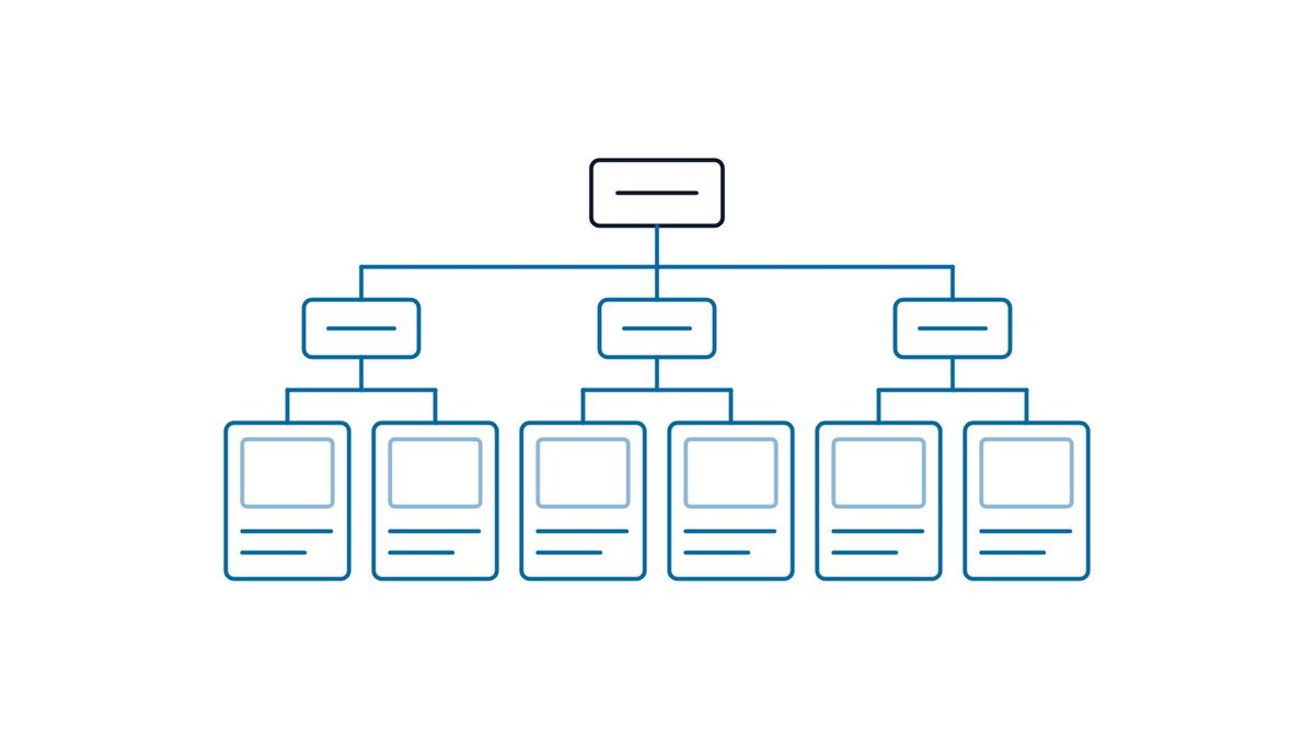
Product Catalog Website Structure for Manufacturers (2026)
Structure a manufacturer catalog site around how buyers search: product type as the backbone, applications as entry points, specs as filters. Group size-only variants into series pages, publish specs as HTML text rather than images or PDFs, keep filter URLs out of the crawl, and never fake prices in Product markup.